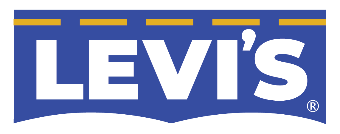
CASE STUDY - for this Design for Good Class project, I selected the brand Levi's, due to the fact that they are the originators of the blue jean, and have been the top competitor to beat since the beginning of jean time. The very first thing I decided to study and research was the logo. After deep thought and exploration, I decided not to stray away from their original look, and update the original logo. The Levi's tab is always red, but I decided to go with the color blue, since Levi's is the inventor of the blue jean. Also, the word "Levi's" is usually lower cased with the exception of the "L", I decided to capitalize all the letters, and make them bold with Google Font, Montserrat Black. The containing shape for the logo is the old cowboy shirt pocket, but instead of diagonal lines on the side, I made them straight. On top of the letters, running across the pocket is the iconic golden stitch we're used to seeing on the Levi's blue jeans.
The 10 second video spot is intended to promote the #teamoutside campaign for #levis2020 ONLINE SALE "UP TO 40% OFF." What a perfect time for an online sale, right! The Call-To-Action is "levi.com" flashing three times. The vibe is black and white, and monochromatic. Different type of jeans, and people are portrayed on the video having fun to target a wide demographic, along with the golden stitch around the frame.
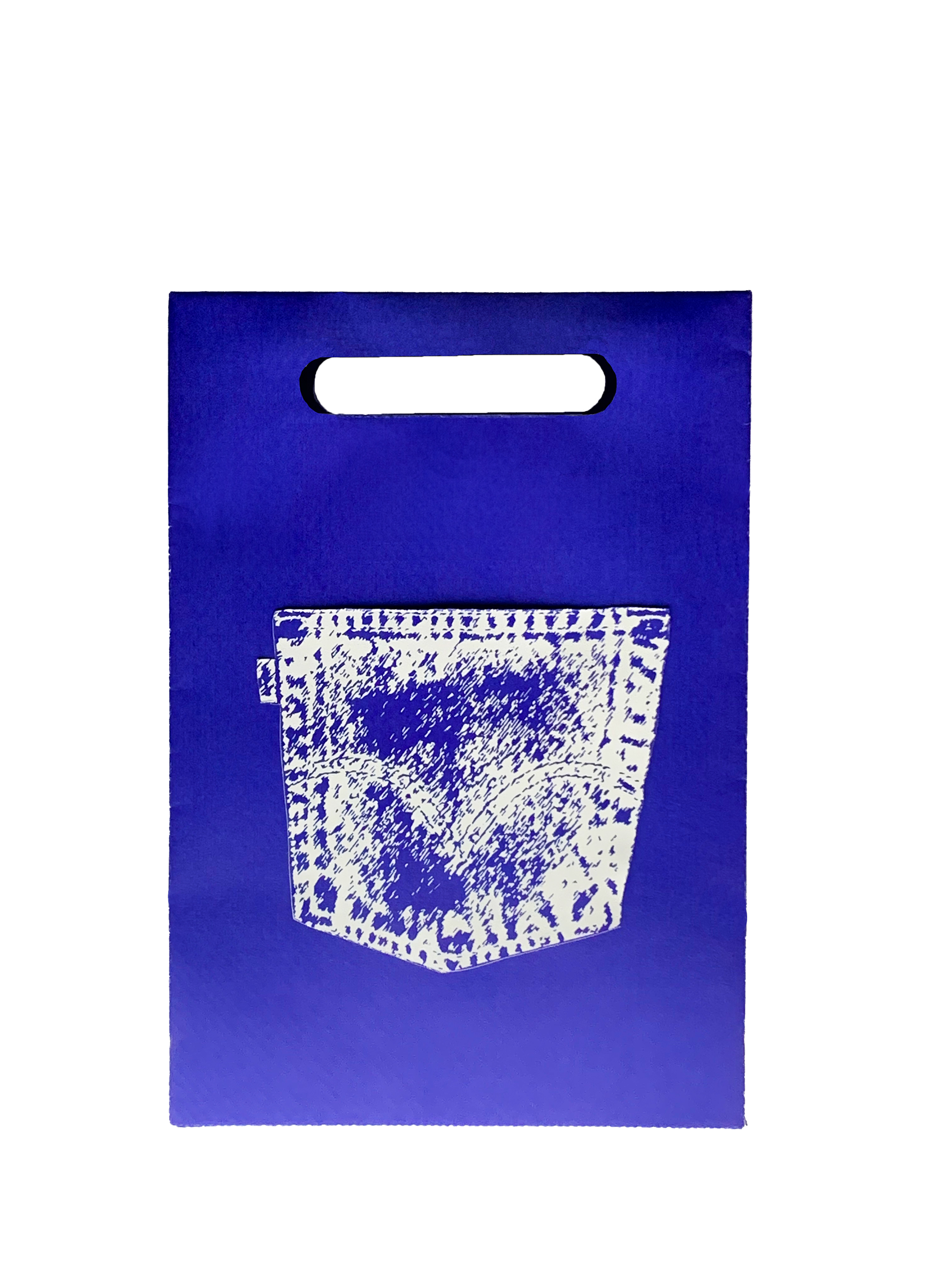
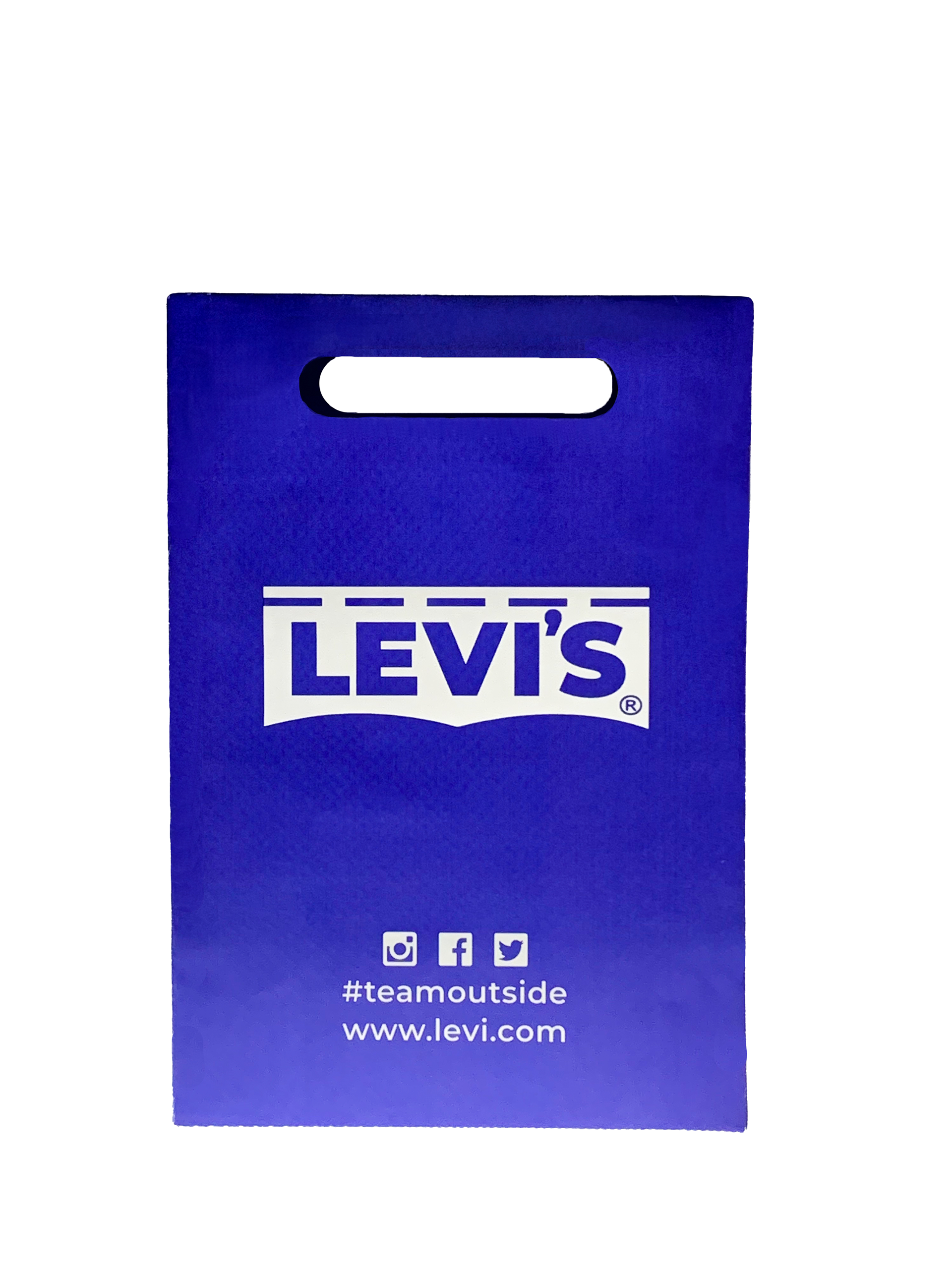
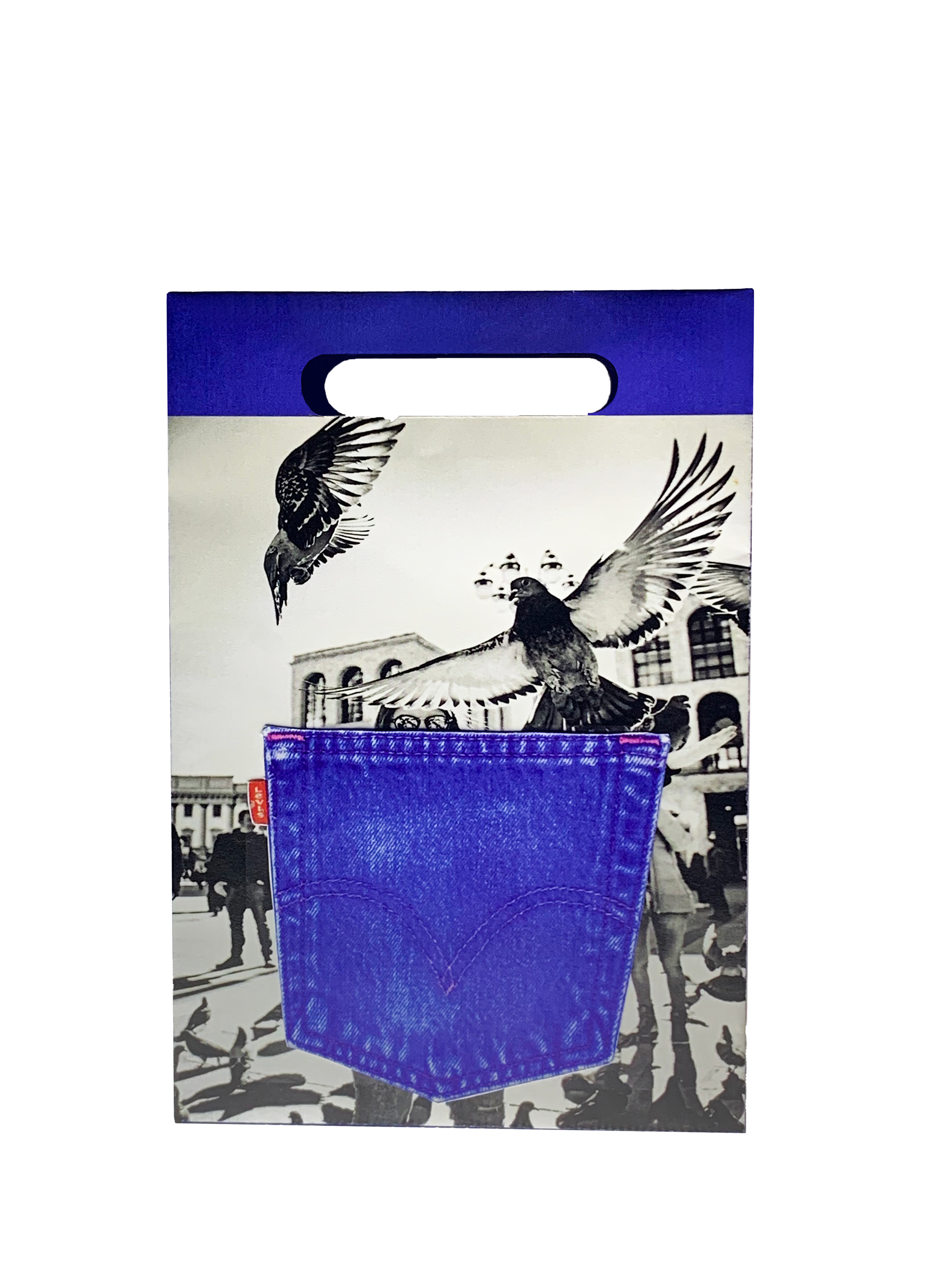
The shopping bags are available in two different options, one being the white pocket (monochrome), the other being the blue jean pocket (black & white). The pockets are used to hold the receipt inside. The front will be the same for both bags, displaying the reversed logo with the social icons, along with the #teamoutside hashtag and the website. Items ordered will be shipped in these bags, and the bags will also be available at the Levi's store locations.
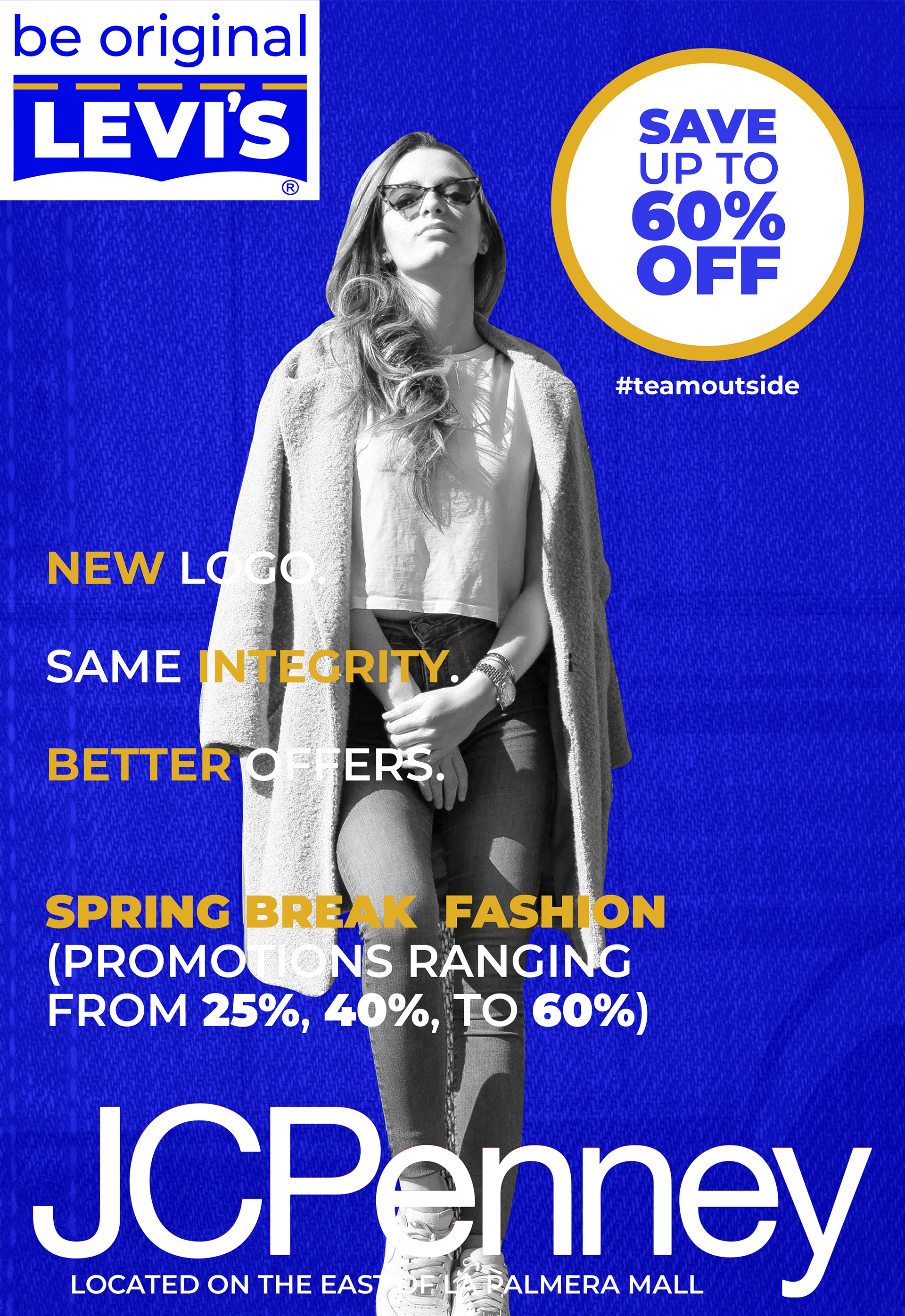
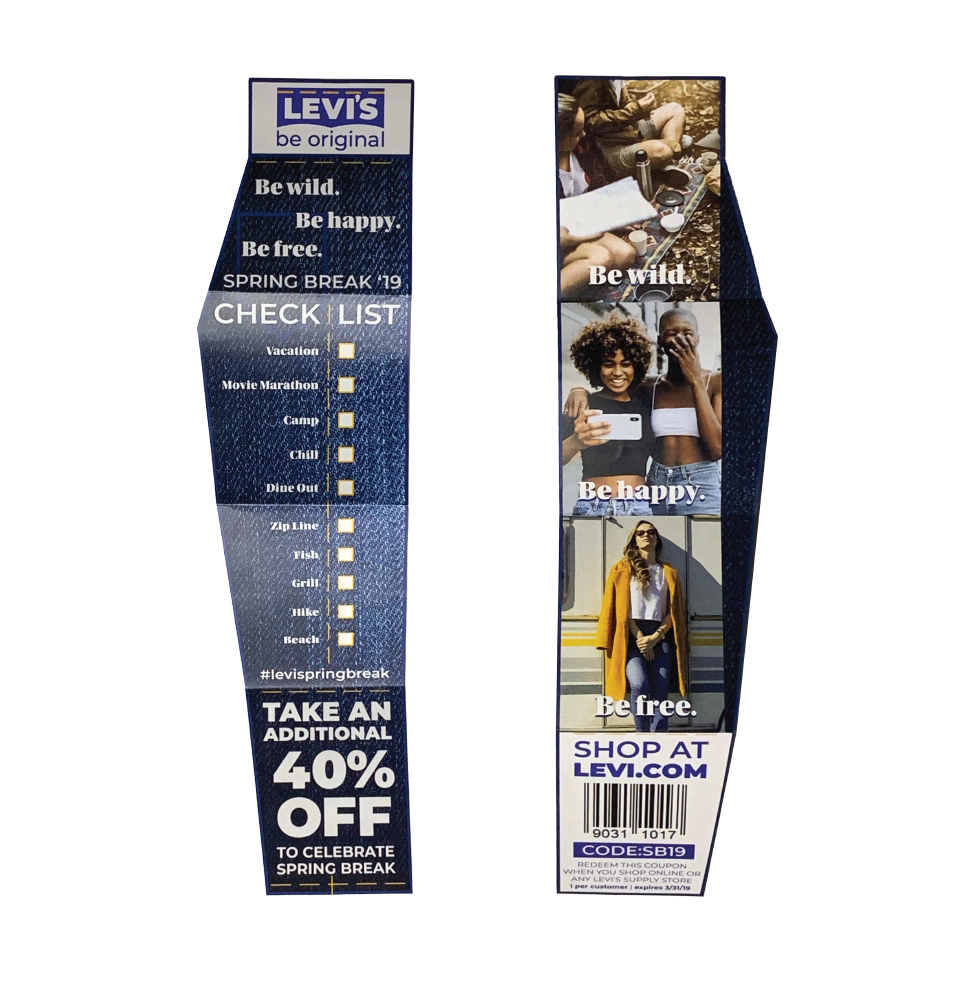
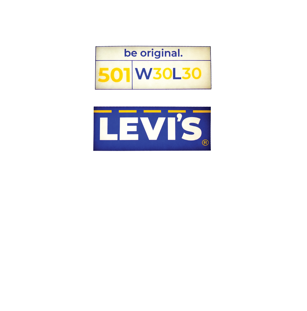
The poster is an oversized back lit sign located inside La Palmera Mall located on South Padre Island Drive in Corpus Christi, TX. The poster promotes a 25%, 40%, and up to 60% OFF in the JCPenney store, while promoting the new logo look, same integrity, and better offers. The crowd intended is high school through college students, this is why I chose to go with the black & white and monochromatic look to stay hip to the crowd. The brochure, I wanted it to be a memorable piece the customer can keep, rather than just throw away after the purchase. So, in order for the customer to keep it and cherish it, I came up with a check list idea that the customer could do during spring break. It can also be applied to summer, winter, you get the point. The point here is to make sure the customer creates a memorable purchase and keeps them coming back for another special experience. Last, but not least, pictured on the bottom is the tag which will be applied to the jeans, displaying the size and style of the jeans, along with the new logo.